


‘Worm’-ing Back into Our Hearts
As Americans have returned to launching into space from American soil, it’s fitting that there’s been another comeback of sorts — but this time for NASA’s iconic retro logo, “the Worm.” Though NASA retired the design in 1992, it was recently resurrected as NASA and SpaceX united for Demo-2, the test mission that brought NASA astronauts Douglas Hurley and Robert Behnken to the International Space Station.
A product of the ‘70s, the Worm began as an answer to the myriad of confusing logos, signs, aircraft markings, and more that the agency had circulating, with each center essentially operating independently in the creative process.
As Worm designer Richard Danne of Danne & Blackburn recalled, “It was somewhat shocking and surprising to us,” more like a “Wild West” of graphic design.
Enter the Worm, which was dreamed up by Danne and Bruce Blackburn in 1974 as an answer to the previously disorganized efforts to help NASA really stand out.
“The RFP (Request for Proposal) arrived in late summer of 1974,” Danne said. “We were somewhat stunned and excited to receive it. While NASA was in a slump, publicity-wise, we all knew this was a very special project. I personally had been interested in flight since a young boy, and followed the space program with rabid interest over the years. As federal agencies go, NASA was innovative, fascinating, and sexy!
“The NEA (National Endowment for the Arts) had decided to put NASA out front and make it one of the very first of the redesign efforts. They felt if they could get an early victory with NASA, that the other federal agencies would be impressed and follow suit. In the end, this is exactly what happened — and their plan worked. So a lot was riding on our redesign efforts, and we definitely felt the pressure.”
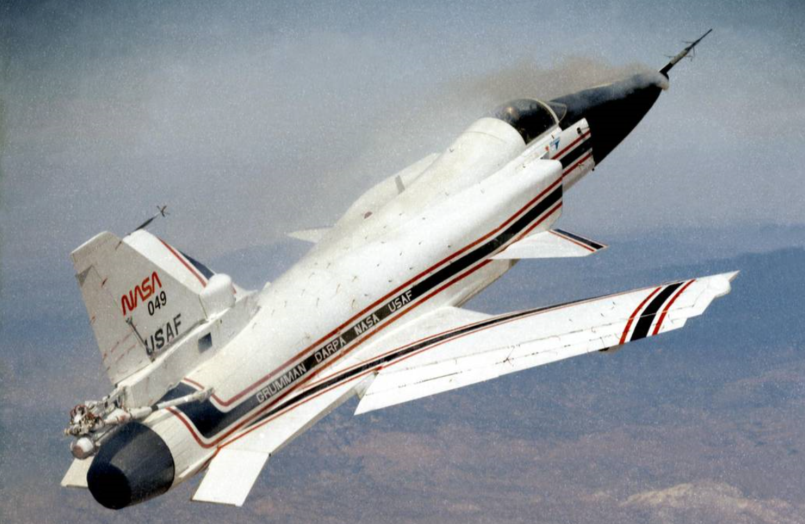
A 1991 photo of an X-29 aircraft sporting the NASA Worm. Credits: NASA
The Worm’s enduring appeal is in its simplicity. Especially now, less is … more. In a decade popularized by minimalism, clean lines and “Marie Kondo-ing” one’s possessions with zeal, the retro resurgence of the Worm is perfectly timed.
“We reached the conclusion that our graphic solution would have to be very strong and simple in order to bring all of these disparate elements into a family look, to create a cohesive agencywide image,” Danne said. “As we worked through the process, which had started with more allegorical solutions (like the Meatball itself), we moved to simpler and simpler solutions, and finally concentrated on a central unifier … a logotype! After deciding that was the path, we concentrated on letterforms that would suggest: tomorrow (the future), technology, movement, flight, and propulsion. We also wanted the mark to be very extendable, to be effective in all media — from a brochure, to an aircraft fleet, to signage, or to a shuttle or spacecraft.”
For Danne and other graphic artists, anything considered timeless is a success.
“The NASA logotype is 45 years old, but doesn’t look old or dated,” Danne said. “Many journalists and critics have reached the same conclusion: It looks better today than back when it was created.”
Indeed, back when the logo was introduced, young NASA staffers took to it like ducks to water, while the older guard gravitated to the Meatball — the circular, busier logo. Those young staffers have now matured and become flight directors and other aerospace professionals, and many of those Worm loyalists reside here at NASA’s Johnson Space Center.
And while the term Worm was initially coined in a derogatory fashion, through the years, the moniker has evolved into something … endearing.
The return of the Worm was announced on April 2, Danne’s 86th birthday, and “Man, what a present that was!” But he was first tipped off to the comeback after a seemingly benign phone call from SpaceX asking him to confirm the “NASA red” color.
“It wasn’t much to go on, but it was a tipoff that they had some adventurous ideas up their sleeves,” Danne said. “Since NASA has involved commercial developers and contactors in their projects, SpaceX has been one of the most aggressive and innovative partner of them all … and their decision to apply our logo to the Crew Dragon rocket opened the door for possibilities with other contractors and NASA itself.”
Danne believes that when the Worm was rescinded in 1992, it somehow increased in value. “And now, with SpaceX opening a huge door for our logo again, many fans have expressed: ‘It righted a wrong, and a lot of us wanted our Worm back!’”
